High-Fidelity Designs
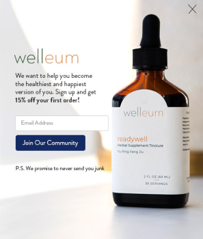
For the product information pages, Wellum wanted a minimalist style. I focused on organizing the content-heavy layouts for optimal desktop and mobile viewing. I enlisted the help of another designer for small illustrative elements. Working cohesively with my fellow designer and the director, we were able to streamline revisions and swiftly meet client needs.


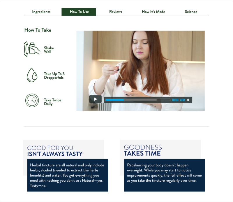
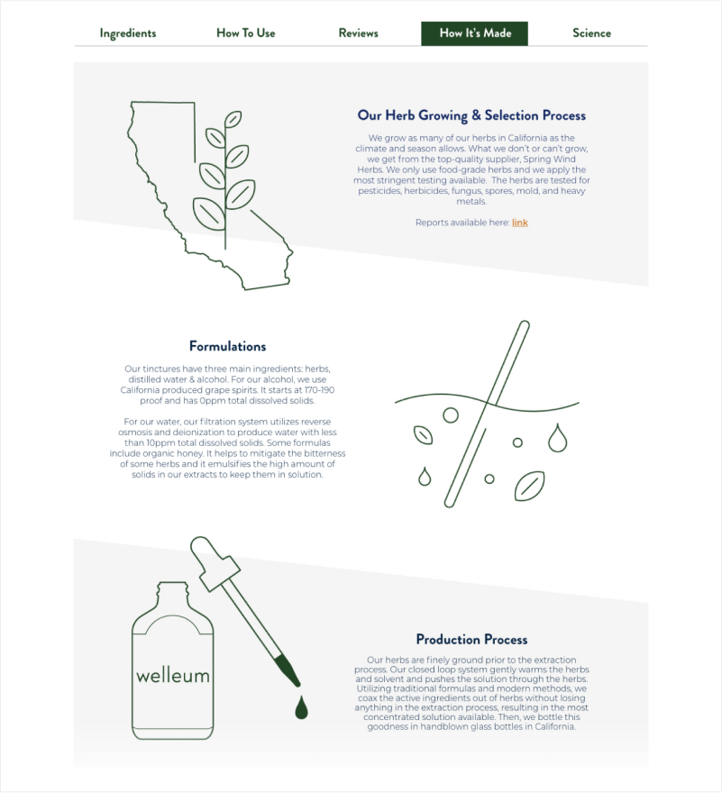
Additional tabs under product Pages
Here are examples of the different tabs where we added graphic elements to make the site more interesting.
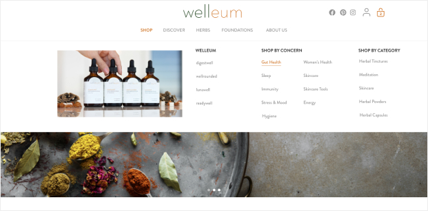
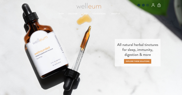
Navigation and Banner Redesign
I also redesigned the additional product page tabs, incorporating graphic elements to add visual interest throughout the site experience. The homepage dropdown navigation and top banner received a clean, minimal redesign.
